2024 promises to be a very eventful year on the African continent, with several countries holding elections. Having experienced an election in the age of AI, misinformation, and data analysis, I thought I would share briefly how the interplay of these and other disciplines may produce unexpected insights. In our case, we stumbled upon a way to forecast election outcomes at a constituency level.
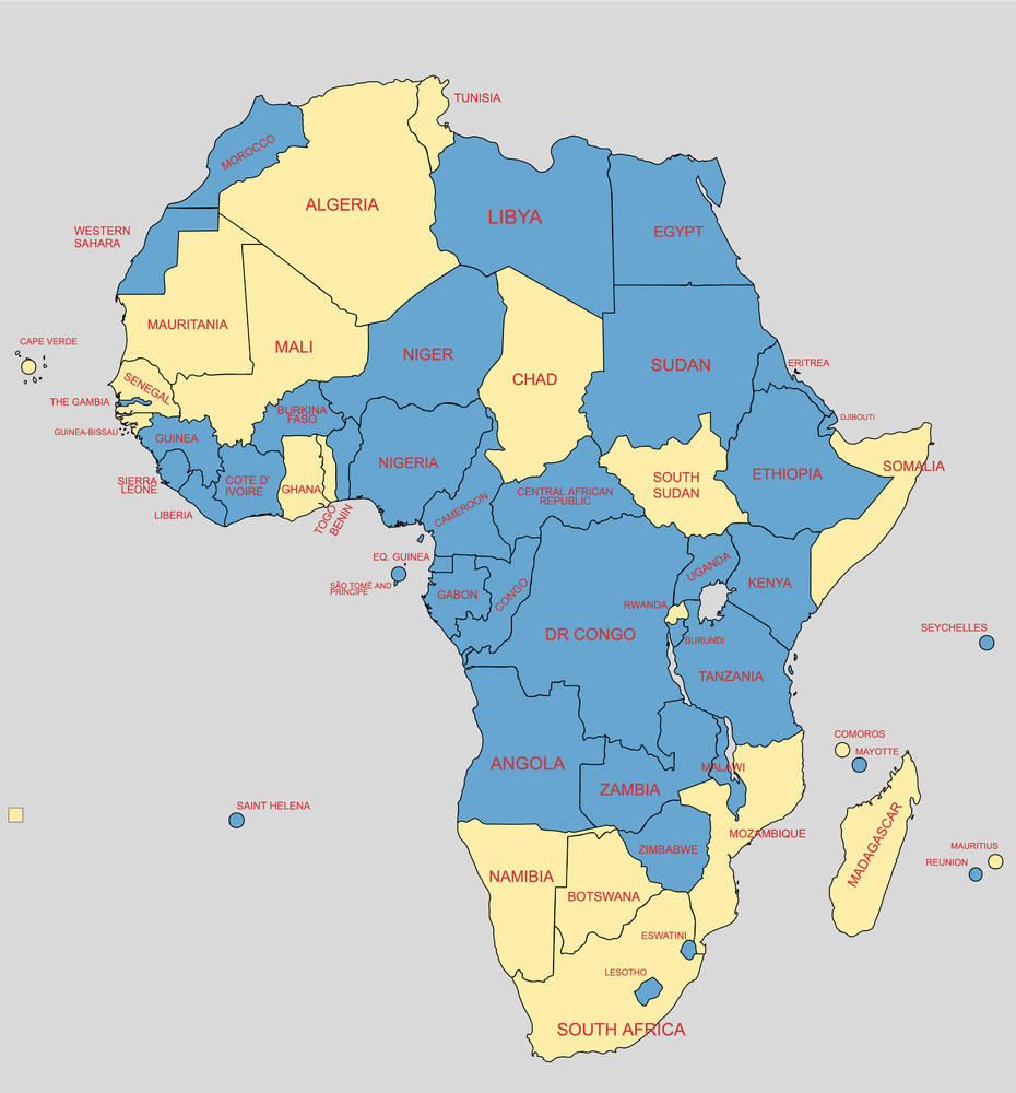
Map of African countries with elections in 2024
Step 1 – Geospatial Data (Who and Where)
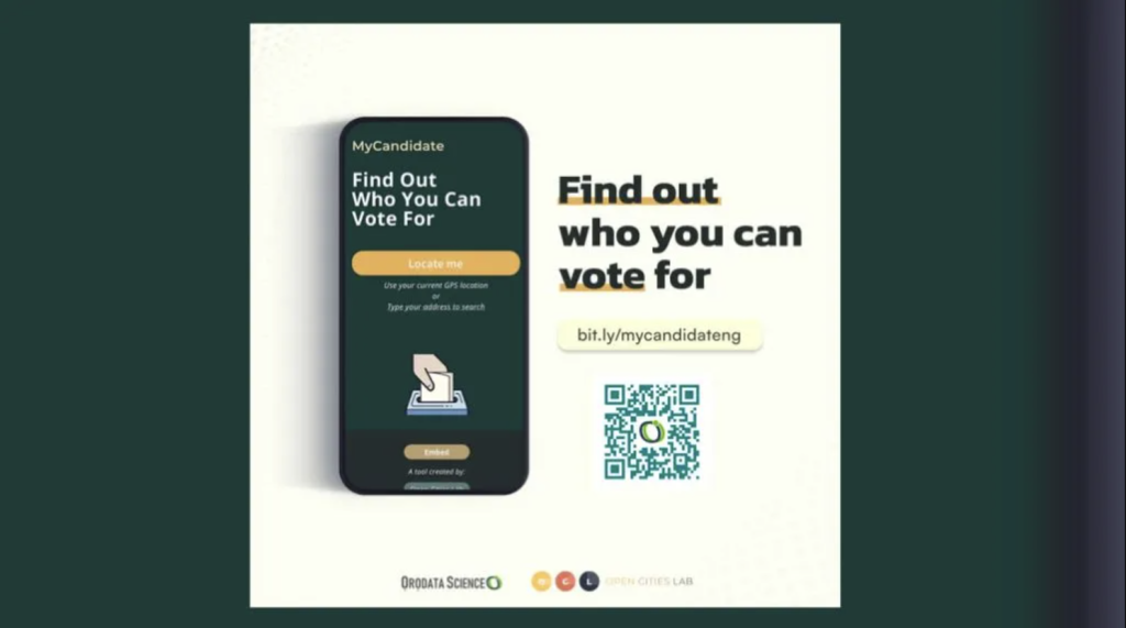
OpenCityLab’s Mycandidate project
As part of my role as Magamba Network’s Tech Projects Officer, my team and I were tasked with creating an Elections dashboard that visually informs the Electorate using infographics and maps. One of our partners in this endeavor was a team from Open Cities Lab , headed by Ella Alcock . We were to be their country partners in implementing their ‘FindMyCandidate’ tool. The tool helps voters view the running candidates based on their address or GPS coordinates. With new electoral boundaries in place for the election, our main task was translating the coordinates found in the delimitation report into geospatial data.
Outcome: Maps and geospatial data based on new electoral boundaries.

Zimbabwe’s MyCandidate Intergration (note politicall neutral colors)
Step 2 – Visualized Data (When and Where)
Election result Visualisations 2023 Map displaying new electoral boundaries
Openparly, a project of Magamba Network, has a repository of election data. The data includes past election boundaries, candidate biographies, and results from previous elections. A goal of the project is to inform and educate the youth on the democratic process in Zimbabwe. The map data collected in the exercise with OpenCityLabs, in combination with Openparly’s election data, was merged by my team to generate easy-to-understand visualizations. These played a key role in Lynette N Manzini ‘s multi-hour Election Day coverage on Openparly’s Facebook page.
Outcome: Election results visualized as color maps.

Lynnette Manzini, 8-hour coverage on Election Day
Step 3 – Bringing Academic Insight: The PhD Advantage (Context)
Mr. McDonald Lewanika came across the work we were doing with visualizations and sent us a copy of his PhD thesis, “Campaigning, Coercion, and Clientelism: ZANU-PF’s strategies in Zimbabwe’s presidential elections, 2008-13”, in which he augments data from other research projects and his analysis to present a more complex picture of electoral competition in Zimbabwe.

Screen capture from Macdonald Lewannika’s article on the eve of the election
His research postulated a mathematical formula and algorithm for predicting election results. After reading the paper, I reached out and had a discussion with him. I outlined how we had map data and election data. Combined with his thesis, we may have a framework for predicting the upcoming election results. This discussion led to a last-minute collaboration where we provided the visualization of his thesis, and McDonald Lewanika summarized his work and added local context.
The result

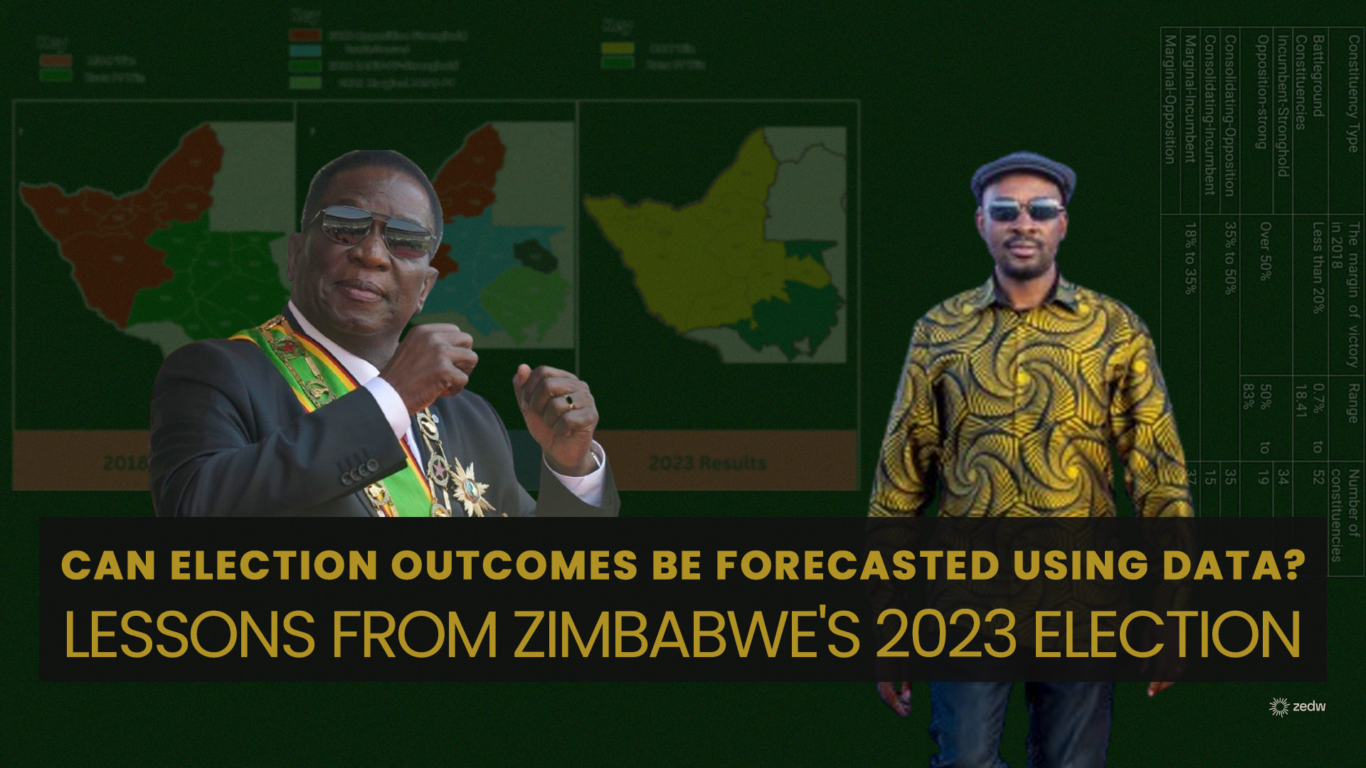
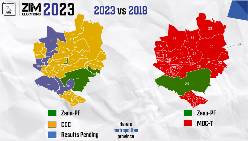
Visualisation showing the “Forecast Framework” applied to Matebeleland North Province
“2018 Results” are depicted as a winners (and losers) map. The visualisation misses out on the nuance of voting patterns ie margins. “The PHD Thesis” mapped out this nuances pointing out areas that could potentially swing in an election. The “2023 Results” shows constituencies that were predicted to swing did in fact swing.
Learnings and Take aways
In no particular order
- Collaboration is Key: Collaborating with organizations like OCL and individuals like McDonald Lewanika enabled us to leverage expertise and resources effectively.
- Utilizing Tools: Leveraging tools such as the FindMyCandidate tool allowed us to translate complex data into accessible information for voters.
- Visual Communication: Visualizations are powerful tools for conveying complex information in a digestible format. By visualizing election data, we provided stakeholders with clear insights into election results and trends.
- Embracing Academic Research: Engaging with academic research, such as McDonald Lewanika’s PhD thesis, provided valuable insights and potential methodologies for predicting election outcomes.
- Continuous Learning and Adaptation: Our collaboration with McDonald Lewanika led to the development of a framework for predicting election outcomes. While untested, this initiative underscores the importance of continuous learning and adaptation in improving electoral processes.
- Local Context Matters: Understanding the local context is crucial for effective election prediction and analysis. By incorporating local insights and data, we enhanced the accuracy and relevance of our forecasting efforts.
- Transparency and Accountability: By sharing our experiences and insights, we contribute to transparency and accountability in the electoral process, fostering public trust and engagement.
- The article is a summary that abstracts the myriad of tools, frameworks and data that went into the whole process. Some of this work took months of painstaking data wrangling, a key learning is opportunities multiply as you seize the initiative.